How to build a responsive navigation section for a website with HTML, CSS and JavaScript


When you visit a standard website, one of the first things you see is a navigation section. You can navigate to any of the website's pages from the navigation section.
All parts of a website must be responsive across different screen sizes, which means that a website navigation section also needs to be responsive.
In this article, you are going to learn how to build the navigation section of a website and firstly, make it responsive on mobile and tablet screens, then, make it responsive on laptop and desktop screens.
Pre-requisite
To follow along with this tutorial, you need to know about
HTML,
CSS and
JavaScript
You will start by writing the markup (HTML) code first, then you will add styling to it to make it look good and responsive and then you will add javascript to make the nav toggling button work.
The HTML part
To build the markup of your webpage, you will create a new file and name it index.html
Then you will add the initial HTML layout which contains the <meta> tag, the <title> tag, the <head> and the <body> tag.
<!DOCTYPE html>
<html lang="en">
<head>
    <meta charset="UTF-8">
    <meta http-equiv="X-UA-Compatible" content="IE=edge">
    <meta name="viewport" content="width=device-width, initial-scale=1.0">
    <title>Responsive Navigation</title>
</head>
<body>

</body>
</html>
In your <body> tag, you will:
create a <header> tag
In your <header> tag you will create a <nav> tag
In your <nav> tag you will create a <div> tag and a <ul> tag
Your <div> tag will contain a <svg> tag and another <div> tag.
The <svg> tag displays the website logo and the other div tag contains <button> tags that makes use of a library called font awesome to display a bar icon and a cancel icon.
Your <ul> tag will contain <li> tags
Each <li> tag will have a respective <a> tag, but for the signup and log-in links, the <a> tags will have a <button> tag each.
  <header>

    <nav>

      <div>
        <div>
          <svg width="80" height="80" viewBox="0 0 109 28" xmlns="http://www.w3.org/2000/svg">
            <text x="0" y="27" text-anchor="start" font-family="sans-serif" fill="#FFFFFF" font-size="40" font-weight="bold">
              NAV
            </text>
          </svg>
        </div>
        <div class="navbar hide">

          <button><i class="fa fa-bars" aria-hidden="true"></i></button>

        <button><i class="fa fa-times" aria-hidden="true"></i></button>

      </div>
    </div>

      <ul>
        <li><a href="/">Home</a></li>
        <li><a href="/about.html">About Us</a></li>
        <li><a href="/faqs.html">FAQS</a></li>
        <li><a href="/signup.html"><button>Sign Up</button></a></li>
        <li><a href="/login.html"><button>Login</button></a></li>
      </ul>

    </nav>

  </header>
To enable the font awesome classes in your <button> tag you will add a <link> tag to your <head> tag and make the font awesome's CDN link the value of its href attribute.
<head>
  <meta http-equiv="content-type" content="text/html; charset=utf-8" />
  <title>Responsive Navigation</title>
  <link rel="stylesheet" href="https://cdnjs.cloudflare.com/ajax/libs/font-awesome/4.7.0/css/font-awesome.min.css">
</head>
After that, you will give classes to each tag that you will use for styling.
For instance, the <header> tag has a class header, the nav tag has a class nav, the <ul> tag has a class nav-list, the <li> tags each have a class nav-item, the <a> tags each has a class of nav-link and the <button> tags each has a class nav-button.
<header class="header">

  <nav class="nav">

    <div class="mobile-nav">
      <div class="logo-container">
        <svg width="80" height="80" viewBox="0 0 109 28" xmlns="http://www.w3.org/2000/svg" class="logo">
          <text x="0" y="27" text-anchor="start" font-family="sans-serif" fill="#FFFFFF" font-size="40" font-weight="bold">
            NAV
          </text>
        </svg>
      </div>
      <div class="navbar hide">

        <button id="open" class="toggle-button"><i class="fa fa-bars" aria-hidden="true"></i></button>

      <button id="close" class="toggle-button"><i class="fa fa-times" aria-hidden="true"></i></button>

    </div>
  </div>

    <ul class="nav-list">
      <li class="nav-item"><a href="/" class="nav-link">Home</a></li>
      <li class="nav-item"><a href="/about.html" class="nav-link">About Us</a></li>
      <li class="nav-item"><a href="/faqs.html" class="nav-link">FAQS</a></li>
      <li class="nav-item"><a href="/signup.html" class="nav-link"><button class="nav-button">Sign Up</button></a></li>
      <li class="nav-item"><a href="/login.html" class="nav-link"><button class="nav-button">Login</button></a></li>
    </ul>

  </nav>

</header>
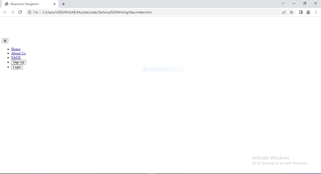
When you run your HTML file in the browser you will see this.
Now let's style
Your navigation section currently looks unresponsive and ugly. You can add styles to make it beautiful and responsive.
In modern front-end web development, you must follow a mobile-first approach when you style your webpage, which means that you will add styles for mobile and tablet (i.e small) screens first.
To begin with, create a file named style.css, then link the file to your index.html file by using the <link> tag and adding the file name/path as the value of its href attribute.
<head>
    <meta charset="UTF-8">
    <meta http-equiv="X-UA-Compatible" content="IE=edge">
    <meta name="viewport" content="width=device-width, initial-scale=1.0">
    <link rel="stylesheet" href="https://cdnjs.cloudflare.com/ajax/libs/font-awesome/4.7.0/css/font-awesome.min.css">
    <link rel="stylesheet" href="style.css"/>
    <title>Responsive Navigation</title>
</head>
Mobile Style
For the mobile styling, you will add these lines of CSS.
* {
  margin: 0;
  padding: 0;
  border: 0;
  vertical-align: baseline;
  overflow-x: hidden;
}

.nav {
  display: flex;
  flex-direction: column;
  justify-content: space-between;
  align-items: center;
  background-color: #000000;
  font-size: 20px;
  padding: 2% 4%;
}

.mobile-nav {
  width: 100%;
  display: flex;
  justify-content: space-between;
  align-items: center;
}

.toggle-button {
  color: white;
  background-color: black;
  font-size: 24px;
}

.nav-list {
  display: none;
}

.show {
  padding-top: 2%;
  display: flex;
  width: 100vw;
  height: 100vh;
  flex-direction: column;
  justify-content: flex-start;
}

.nav-item {
  height: 50px;
  font-size: 20px;
  text-align: center;
  padding: 3%;
}

.nav-button {
  padding: 6px 14px;
  border-radius: 2px;
}

.logo-container {
  justify-content: space-between;
  margin-right: 2%;
}
After adding these styles and you run your code in the browser, you will see a beautifully displayed navigation section just like this.
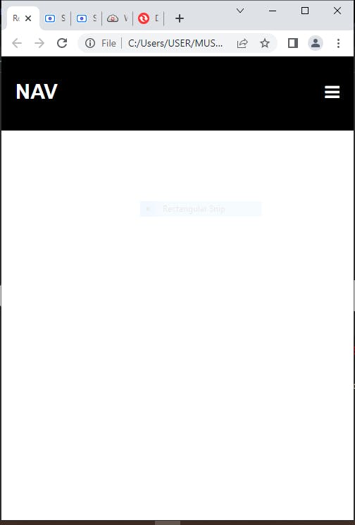
This is for mobile and tablet screens, next you will be adding styles for desktop screens.
But, before then you need to add JavaScript code to make your navigation bars toggle open and close.
Javascript for nav bar toggling
For your javascript code, you will create a new file and name it script.js. Then you will link it to your index.html file by adding a script tag after your body tag and setting the tag's src attribute to the JavaScript file's file path.
    </header>
  </body>

  <script src="./script.js"></script>

</html>
Then, in your script.js file, you will first select the open and close buttons and the navigation list by using a query selector. Then, you will add an event listener to hide the close button when your webpage loads.
After that, you will add an event listener that displays the nav list, hides the open button and displays the close button when you click on the open button.
Then, you will add an event listener that hides the nav list, hides the close button and displays the open button when you click on the close button.
let isOpen = document.querySelector('#open');
let isClose = document.querySelector('#close');
let navList = document.querySelector('.nav-list');

window.addEventListener('load', function() {
  isClose.style.display = "none";
})

isOpen.addEventListener('click', () => {
  navList.classList.add('show');
  isClose.style.display = "inline-block";
  isOpen.style.display = "none";
});

isClose.addEventListener('click', () => {
  //isClose.classList.toggle('hide');
  navList.classList.remove('show');
  isClose.style.display = "none";
  isOpen.style.display = "inline-block";
});
After adding your javascript code, your website's navigation section should be like this

With this, you have successfully built a navigation section for your website that is responsive on small and medium screens. What remains now is to make it responsive on large screens.
For Large Screens
To make your navigation section responsive on large screens you will add a media query.
A media query is a feature of CSS that allows styles to be applied to a webpage based on certain conditions like screen resolution and so on.
Add a media query to your CSS file that will apply the styles below if your website is viewed with a device that has a minimum screen width of 768px.
@media only screen and (min-width : 768px) {
  .nav {
    display: flex;
    flex-direction: row;
    justify-content: space-between;
    width: 100vw;
    padding: 2% 6%;
    background-color: #000000;
    font-size: 20px;
  }

  .logo{
    color: #ffffff;
    font-size: 25px;
    font-weight: bold;
  }

  .nav-list {
    display: flex;
    flex-direction: row;
    width: 100%;
    float: right;
    margin-right: 10%;
    padding-top: 12px;
    justify-content: space-between;
    align-items: center;
    list-style: none;
  }

  .nav-item:hover{
    background-color: gray
  }

  .nav-item {
    display: inline;
    color: #ffffff;
  }

  .nav-link {
    text-decoration: none;
    color: #ffffff;
  }

  .nav-button {
    padding: 10px 20px;
    border-radius: 4px;
  }

  .hide {
    display: none;
  }
}
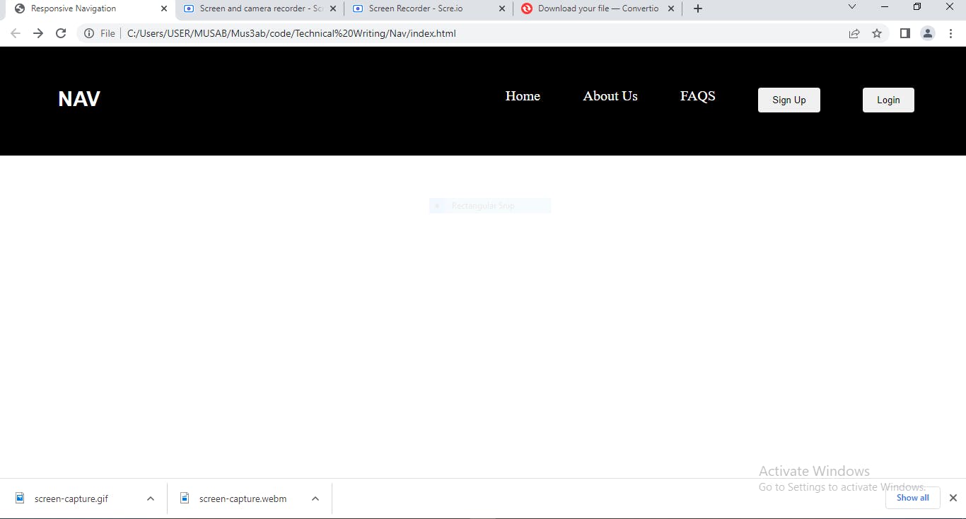
After you are done with that and you run your index.html file you should see something like this.
And that's pretty much it
Now, you should be able to build a navigation section for any of your websites with HTML, make it responsive with CSS and make the toggling functionality work with JavaScript.
Therefore, you can start building other sections of your website, so you can have a full website.
Thanks for reading till the end. Don't forget to like this article if you found it interesting.
Leave a comment if there is any part of this article you want to add or make corrections to.
Keep on learning, keep on building.